Large sidebar
Fluid Layout with responsive Column
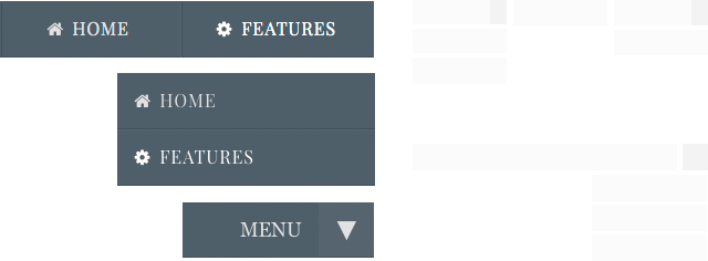
New navigation concept
in this Theme all menus are visible simultaneously.
New in version 1.1.3
- New Option to add a ”Progress Bar" to show how far your web-page has been scrolled.
Options: Show/Hide, Custom colors, Custom thickness, Hide in small devices.
Key features
Clean Design, Elegant layout, Smooth animations
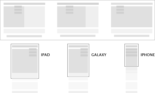
RESPONSIVE LAYOUT
Banner Image
Responsive Columns (no plugins)
Color options Layout & text.
Progress bar
Options for iPad and iPhone
2 Extracontent areas
Perfect logo (autosize)
Multiple Widths
Fade-in effects
Photo Album with PrettyPhoto
Awesome icons + Plus code
Social Icon with Awesome Fonts
Styled Tooltip
20 WebFonts (offline)
Back to top button
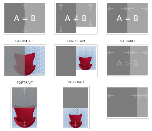
Scales to Any Width:
Duo uses percentages, your fluid columns will fit into any width.
Two columns are a great way to make better use of your content canvas area.
Font customization:
Duo comes with several Google Fonts you can choose from with the click of a button. Thanks to the “Plus Code” you can animate any text or icon.
Images customization:
Duo theme allow you to customize the look of your project with several images for the body and the column. You can use also your own imagery for the background.
Demo Project:
An extended version of the demo online is available with the theme.
Easy to use and customize.
Responsive Columns / Options
Columns with variable width and height. Combined or misaligned.
Features List
Max Width:
950, 1000, 1050, 1150, 1200, 1250, 1300, 1350, 1400, 1450, 1500.
Header:
You can turn On/Off the header (titles and logo).
Option in “[+] Combo options:”
Navigation :
Horizontal and / or Vertical navigation with Trigger button.
Navigation BreakPoint:
870, 930, 990, 10550, 1110, 1170, 1230 and Vertical Toolbar Only ( hide the Horizontal version)
Background: Column (Extrac. 1 + Sidebar)
-Full height: One Box for both Columns
Flat Color: Full height
Fluid Image 1/2/3/4: Full height
Tile 1/2/3/4: Full height
Background: Body
Banner Image + 11 images
- Separated Columns
Flat Color: Different heights
Fluid Image 1/2/3/4: Different heights
Tile 1/2/3/4: Different heights
Transparent (Image and Color Off)
Photo Album:
Classic album + Slideshow through prettyphoto. Option in “[+] Combo options:”
Extracontent:
Two extra content areas.
Column Width (Extrac. 1 + Sidebar)
- 50% , 40% , 30%, 25%,
- 50% , 40% , 30%, 25% with Padding Off in Sidebar
- Column Off (Extracontent 1 and Sidebar Off)
Responsive Image:
Apply the responsive behavior to any image
WebFonts ( offline fonts):
20 fonts for classes, toolbar and sitemap page.
Responsive Options:
Build in support for iPad / tablets / iPhone / Smartphone
Awesome icons + Plus code:
Full support for the Awesome icons with our "Plus" code. Simple code to animate text, icons and images. All social-icons are available through the Awesome font.
On Scroll page “effects”
Animate your content page with some scroll effects. Fade In = scroll1; Bounce In Left = scroll2; Bounce In Up = scroll3; Fade In Down = scroll4; Light Speed In = scroll5; Flip In X axis = scroll6. All examples in the DEMO project.
Navigation:
- Text: Webfont Off
- Text: Uppercase (First level)
- Use Big Awesome Icons
- Centered text in Horizontal menu
- Centered Vertical Menu
- Show "MENU" text (you can edit the text)
- Show Extra Bottom Nav. Show second - toolbar with first level only.
Combo options [+] :
Theme customized options are effective if easy to use. We have created a small list of favorite options to help you manage the theme easily and quickly. Each entry of the quick menu corresponds to a standard full menu!
- Layout: Fade-In page
- Layout: Disable Header (title and logo Off)
- Layout: Page Frame
- Layout: Extracontent 2 Padding Off
- Layout: Show transparent triangles
- Layout: Tooltip (choose color below)
- Layout: Content Font "Georgia"
- Back to Top Button
- Text justified
- Sitemap Page: Show structure
- Photo Album: PrettyPhoto SlideShow
- Force "Open link in new window" via Javascript