O
Features
Overlapping images option, Unleash your creativity!
Option visible in all desktop browsers
EXTRA
CONTENT
New in this version 1.1
• Fixed issue in RapidMaps plugin.
• Updated the Pretty Photo slideshow ( for Photo Album) to the latest version.
• Code optimized.
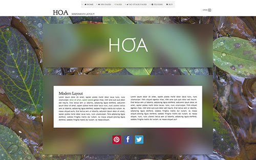
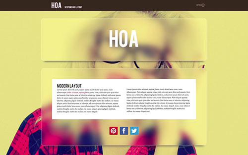
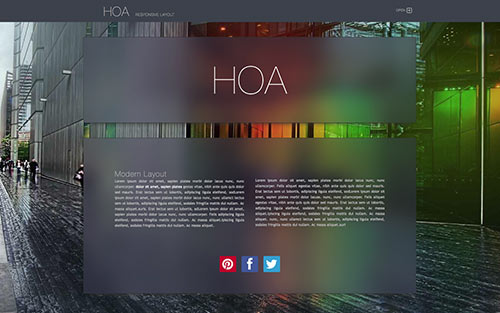
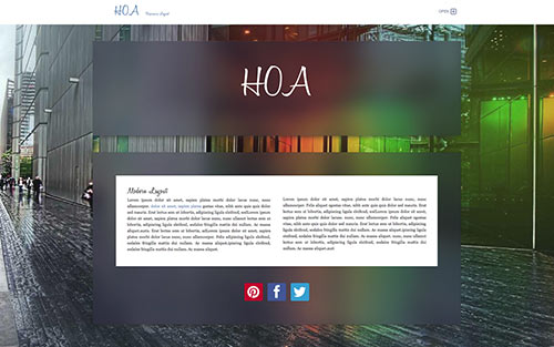
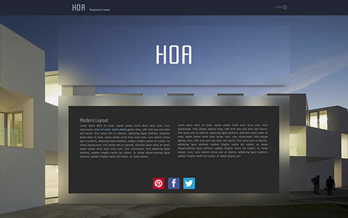
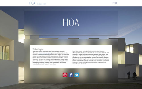
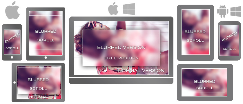
Responsive Design
The design will scale to fit on all browser widths/resolutions and on all mobile devices. Go ahead and scale your browser window and see the results.
Inside the box
In the DMG file we enclose the theme, the readme.pdf, a demo RW Project and the guide for the Plus code ( animation text/icons and images). Moreover we enclose a folder with several images for your customization.
key features
• Option: Banner image
• Fade-in effects in top toolbar
• Photo Album with PrettyPhoto
• Social Icon
• Awesome icons + Plus code
• Styled Tooltip
• 21 Built-in WebFonts
• Back to top button with bread navigation
• Multiple Widths
• Colour with alpha channel
• Image with rounded corners
• Text Size and rounded corners with Slider

• RESPONSIVE LAYOUT
• Query / CSS 3 / HTML5
• 2 toolbar styles
• Progress Bar
• Options for iPad and iPhone
• 4 Extracontent areas
• Multiple background images
• Prevent downloading images
Features
Page Style:
11 Styles made with PNG images in double version. Retina and non retina.
Content Width:
850, 950, 1000, 1050, 1150 pixel and Fluid (use the Fluid width only with Stacks + Resp. columns)
WebFonts:
11 fonts for classes, toolbar and sitemap page.
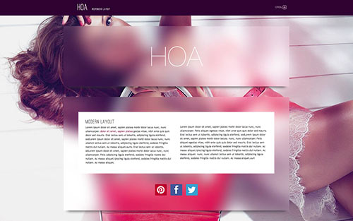
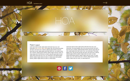
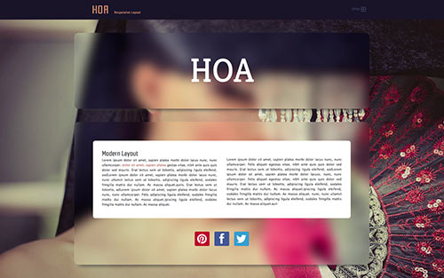
Extracontent Options
1,2,3 and 4 on/off
1,2 and 3 Padding off and full width (use the Full width only wuth Stacks + Resp. columns)
Extracontent 4 ( accordion behavior): Padding On/off, show button text and text customizable.
Extracontent Styles:
Extracontent 1 and 2: 10 images + blurred version + 3 tile textures + color options.
Extracontent 3 and 4: 3 tile textures + color options.
Photo Album:
Classic album + Slideshow through prettyphoto.
Bottom Navigation:
- Back To Top Button
- Bread navigation
- Back To Top Button + Bread navigation
- Off : Top Button and Bread navigation
Social icons:
59 different icons styled as animated buttons/colors. Easy setup (read below)
Awesome icons + Plus code:
Full support for the Awesome icons with our "Plus" code. Simple code to animate text, icons and images.
Font Text:
4 fonts for the text
Responsive Image:
Apply the responsive behavior to any image
Responsive Options:
Build in support for iPad / tablets / iPhone / Smartphone
- Expanded Toolbar
- Submenu Inline
- Hide bottom toolbar
- Responsive Toolbar: Customize button text
[+] Combo options:
Theme customized options are effective if easy to use. We have created a small list of favorite options to help you manage the theme easily and quickly. Each entry of the quick menu corresponds to a standard full menu!
- Text uppercase
- Tooltip (choose color in the color area)
- Page: padding off
- Extracontent 1+2 Hide Graphics Extracontent 1 bottom + Extracontent 2 top
- Text justified
- Title: Silver gradient (no text shadow)
- Toolbar: WebFont Off
- Sitemap Structure + Blog Archive on top: Show/ hide.
- Photo/Movie Album Thumbnails: Rounded ( available in all browsers ex. IE8)
- Photo Album: PrettyPhoto SlideShow
- Fade-in effect: Top Toolbar and logo
- Disable "right click" to prevent downloading images
Color options:
Tooltip: Text and Background
Title, Slogan and Extracontent 4 Top button
Toolbar: Link Colour, Highlight Colour and Background
Page: Text Colour, Highlight Colour and Background
Extracontent 1, 2, 3 and 4: Link Colour, Highlight Colour and Background